· 4 min read · Joshua Oas
Building a page builder with Astro content collections and Sveltia
- Astro
- CMS
- TypeScript
- Sveltia
After building a fairly large page builder with Strapi and Next.js, I wanted to try the opposite approach: keep the flexibility, lose the complexity. No drag-and-drop interface or bulky WordPress-style plugin builder, just reusable, pre-designed sections that can be stacked together to create a page. Astro turned out to be a great fit for that experiment.
What changed: I made the Strapi/Next.js experience the starting point, emphasized reducing complexity, and positioned Astro and Sveltia as the experiment.
The idea
Every page is a Markdown file. Instead of the content living in the body, it lives in a blocks array in the frontmatter:
---
title: Development
blocks:
  - type: hero
    eyebrow: Development
    title: Client focused.
    highlight: Innovative solutions.
  - type: richText
    content: |
      I started building websites around 2002...
  - type: projectGrid
    heading: Projects
---
Each item has a type, and the rest of its fields depend on what that type is. Everything else is making that list safe and easy to render.
Step 1: describe the blocks with a schema
Astro content collections let you validate frontmatter with Zod, which is great, because it picks the right schema based on the type field:
import { z } from 'astro/zod';

const blocks = z.discriminatedUnion('type', [
  z.object({
    type: z.literal('hero'),
    title: z.string(),
    highlight: z.string().optional(),
    image: z.string().optional(),
  }),
  z.object({
    type: z.literal('richText'),
    content: z.string(),
  }),
  z.object({
    type: z.literal('projectGrid'),
    heading: z.string().optional(),
    limit: z.number().int().positive().optional(),
  }),
]);

export type Block = z.infer<typeof blocks>;
Two nice side effects:
- If an editor saves a hero without a title, the build fails with a clear error instead of shipping a broken page.
- TypeScript knows exactly which props each block component receives.
Step 2: one component per block
Each block is a normal Astro component. The props type comes straight from the schema:
---
import type { Block } from '@/content.config';
type Props = Extract<Block, { type: 'hero' }>;
const { title, highlight, image } = Astro.props;
---
<section class="hero">
  <h1>{title} {highlight && <span class="text-gradient">{highlight}</span>}</h1>
  {image && <img src={image} alt="" />}
</section>
Step 3: a renderer that maps type → component
---
import Hero from './Hero.astro';
import RichText from './RichText.astro';
import ProjectGrid from './ProjectGrid.astro';

const registry = { hero: Hero, richText: RichText, projectGrid: ProjectGrid };
const { blocks } = Astro.props;
---
{blocks.map((block) => {
  const Component = registry[block.type];
  return <Component {...block} />;
})}
Step 4: one route for every page
A catch-all route, src/pages/[...slug].astro, generates a page for every file in the collection. Drop pricing.md in the folder and /pricing exists on the next build. [..slug] would use PageView.astro
---
import { render, type CollectionEntry } from 'astro:content';
import BaseLayout from '@/layouts/BaseLayout.astro';
import BlockRenderer from './blocks/BlockRenderer.astro';
import { mdPath, pagePath } from '@/lib/llms';
interface Props { page: CollectionEntry<'pages'> }
const { page } = Astro.props;
const { title, seo, blocks } = page.data;
const { Content } = await render(page);
const hasBody = Boolean(page.body?.trim());
---
<BaseLayout title={seo.title ?? title} description={seo.description} image={seo.image} noindex={seo.noindex} markdown={mdPath(pagePath(page))}>
  {blocks.length > 0 && <BlockRenderer blocks={blocks} />}
  {hasBody && (
    <>
      {blocks.length === 0 && (
        <header class="relative isolate overflow-hidden border-b border-white/5">
          <div class="bg-aurora absolute inset-0 -z-10"></div>
          <div class="container-x py-16 sm:py-20"><h1 class="text-4xl font-semibold sm:text-5xl">{title}</h1></div>
        </header>
      )}
      <div class="container-x section !pt-12">
        <article class="prose prose-invert max-w-3xl prose-headings:font-display prose-a:text-brand-300">
          <Content />
        </article>
      </div>
    </>
  )}
</BaseLayout>
---
import { getCollection, type CollectionEntry } from 'astro:content';
import PageView from '@/components/PageView.astro';
export async function getStaticPaths() {
const pages = await getCollection('pages', ({ id, data }) => id !== 'home' && (import.meta.env.DEV || !data.draft));
return pages.map((page) => ({ params: { slug: page.id }, props: { page } }));
}
interface Props { page: CollectionEntry<'pages'> }
const { page } = Astro.props;
---
<PageView page={page} />Step 5: give editors a UI
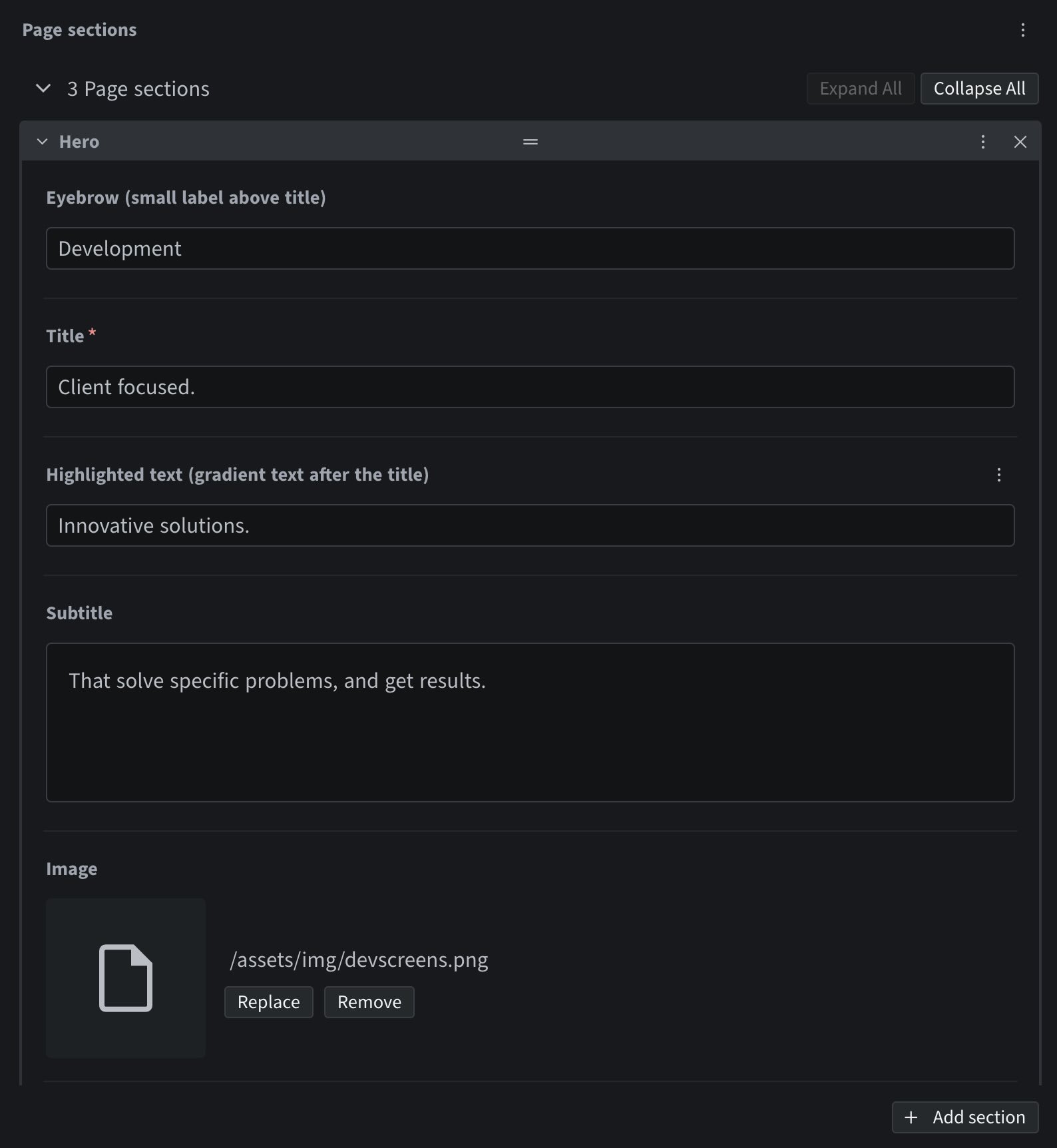
This is where a Git-based CMS shines. In Sveltia (or Decap) CMS, a list widget with types produces exactly the same shape as the schema: each list item gets a type key and its own fields. Editors get an Add section button with a menu of block types, can drag them to reorder, and the CMS commits Markdown to the repo.
The one rule: the CMS config and the Zod schema have to agree. I keep a short checklist in the README for adding a block:
- Add it to the schema.
- Create the component.
- Register it in the renderer.
- Add it to the CMS config.
If I forget step 4, the block just won’t show up in the editor. If I mess up a field name, the build catches it.
Where this approach stops
It’s not a visual drag-and-drop canvas, and I don’t want one. Editors pick from sections that are already designed, which keeps the site consistent. If you need pixel-level layout control for non-technical users, a hosted visual builder is probably worth paying for. For a portfolio, a marketing site, or most small business sites, this does do a great job.